Raida Collection
Brand Strategy, Visual Identity, Content, Digital, Packaging + Print
Raida Collection is a modest fashion brand tailored for young women to help them feel classy while still maintaining the edge that celebrates their personalities.
Raida in Arabic, means leader. Young girls all strive to be leaders in the spaces they occupy- we want to make our mark as leaders with class.

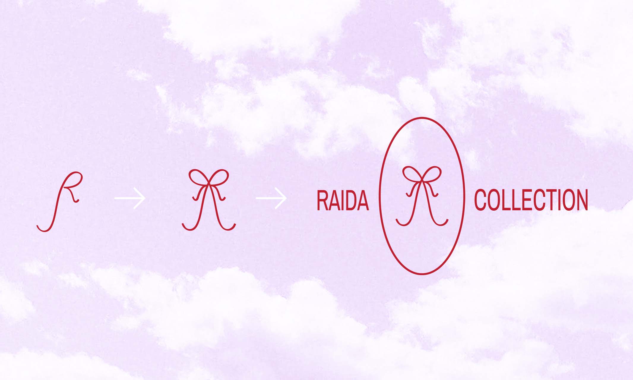
Logo + Wordmark
The logo and wordmark represent the feminine youthfulness and freedom of girlhood since the modern day “Cool Girl” embraces her feminity and owns her agency in life decisions. The Logo represents a Bow Icon which speaks towards that youthful femine energy. The Bow is created with two decorative and delicate R’s that represent the brand. In juxtaposition to the bow's delicate softness, the bold and commanding Archivo font exudes confidence. The Logo and Font decision make the perfect pair to represent confidence with class.

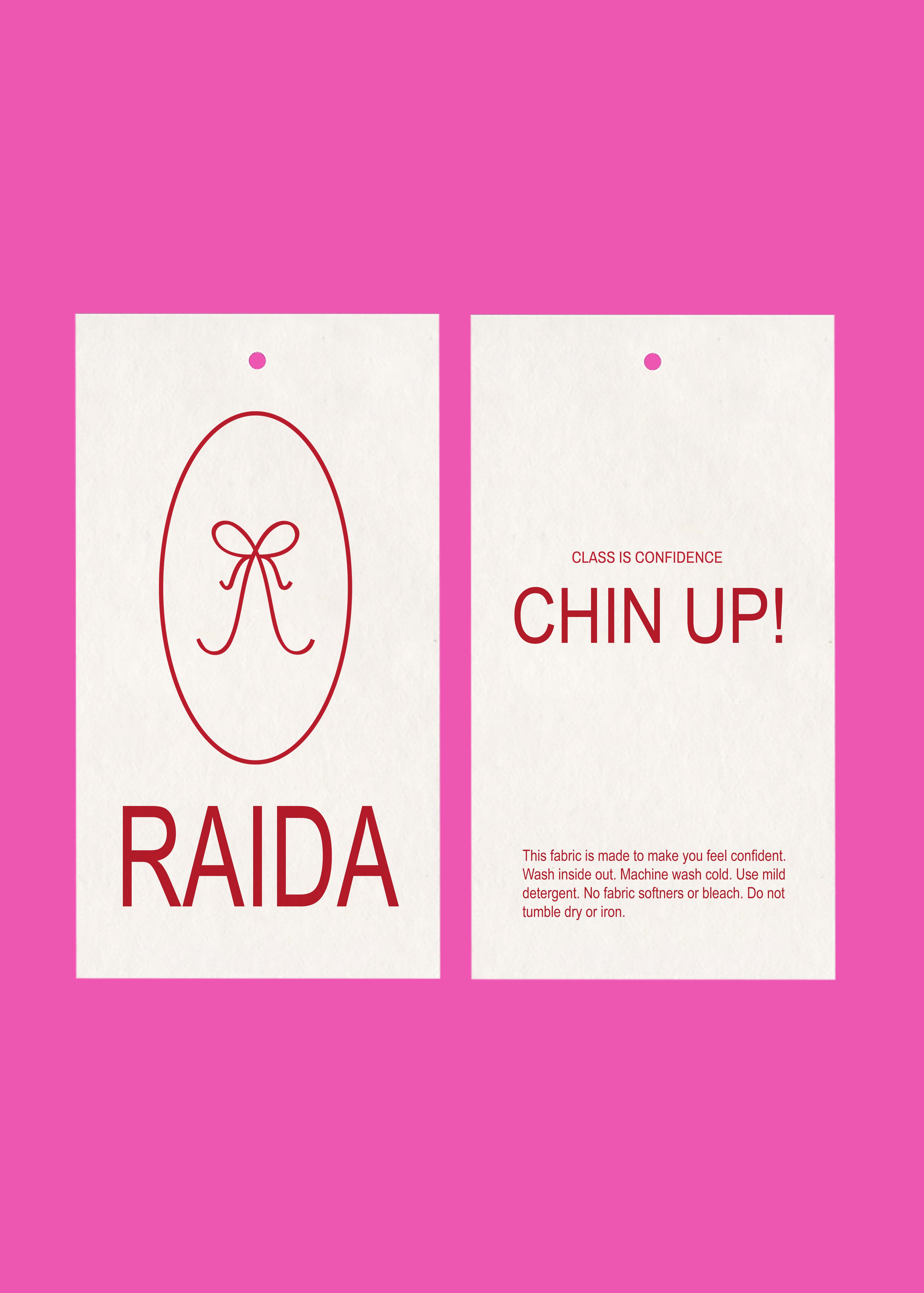
1. Clothing Tag

2. Promotional Instagram Story Ad Graphics

3. Boxed Packaging


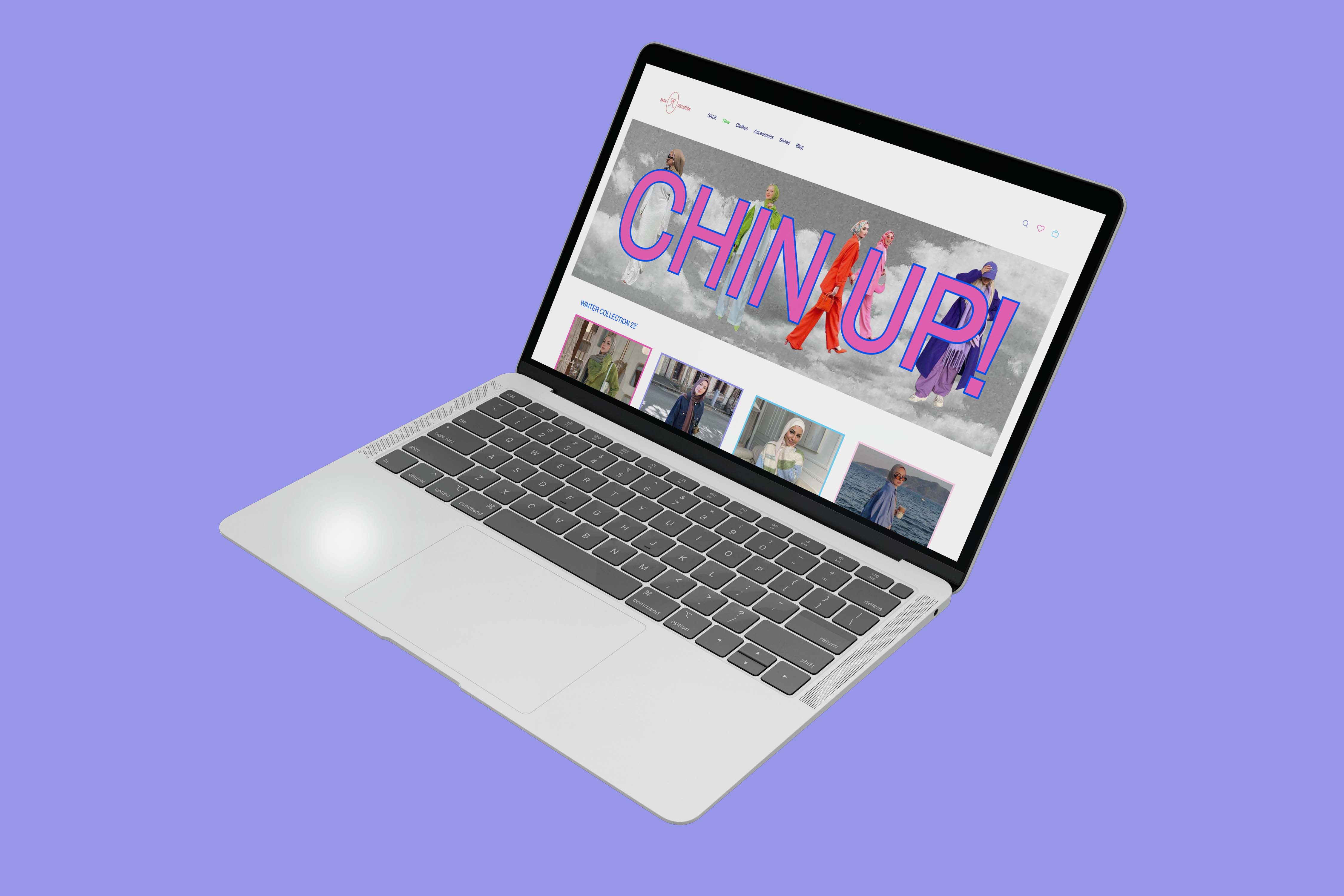
4. Website Landing Page

5. Promotional Instagram Posts


6. Merchandise

Tools Used: Illustrator +Figma + Photoshop
January 2024