SmartStart School
Brand IdentitySmartStart School is a Developmental Sensory Relationship-based Education Preschool located in Santa Monica. It has been serving special needs children since 1992.
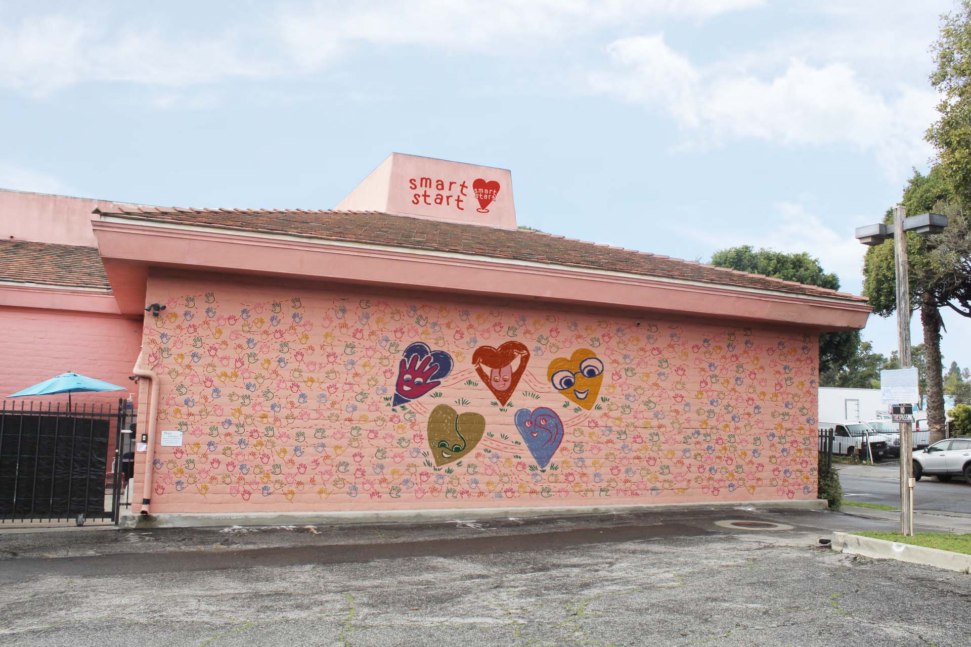
Mural & signaage to represent the identity of SmartStart
Problem:
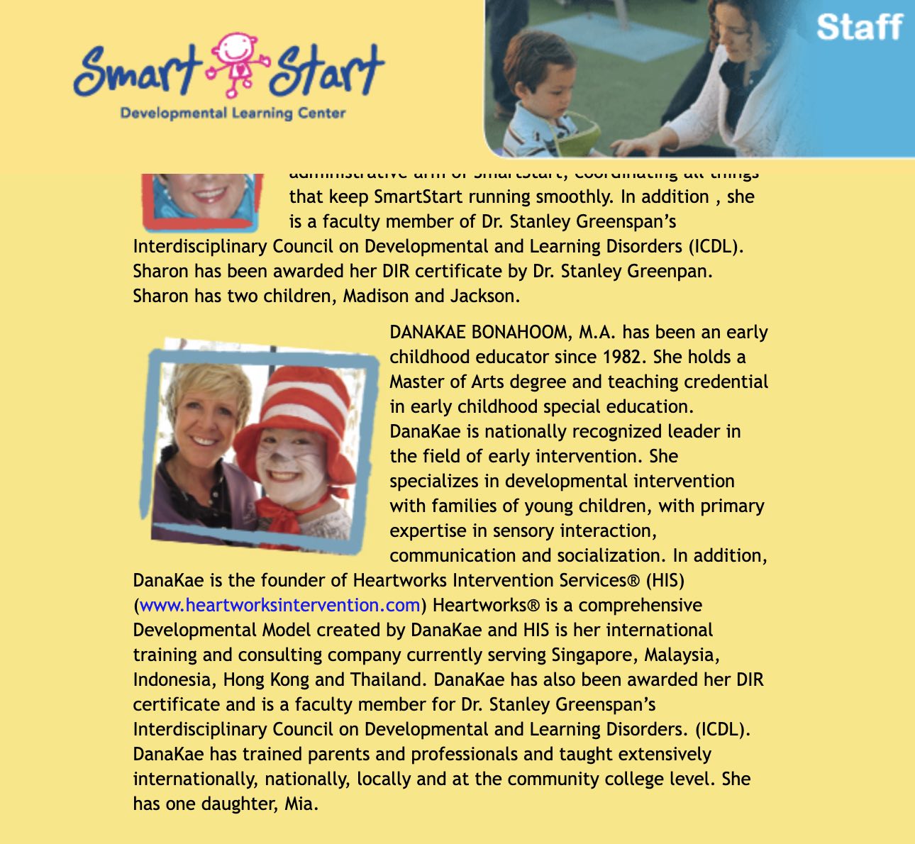
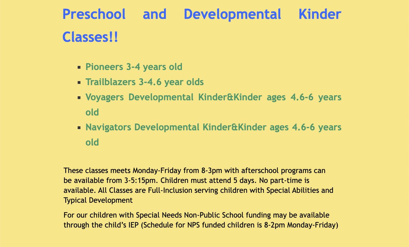
SmartStart holds an honorable reputation within Los Angeles, but the Preschool’s brand is underdeveloped, outdated, and disconnected from its main message. From the logo to the poor website execution, SmartStart lacks a representative identity. Below are screen-grabs from the website.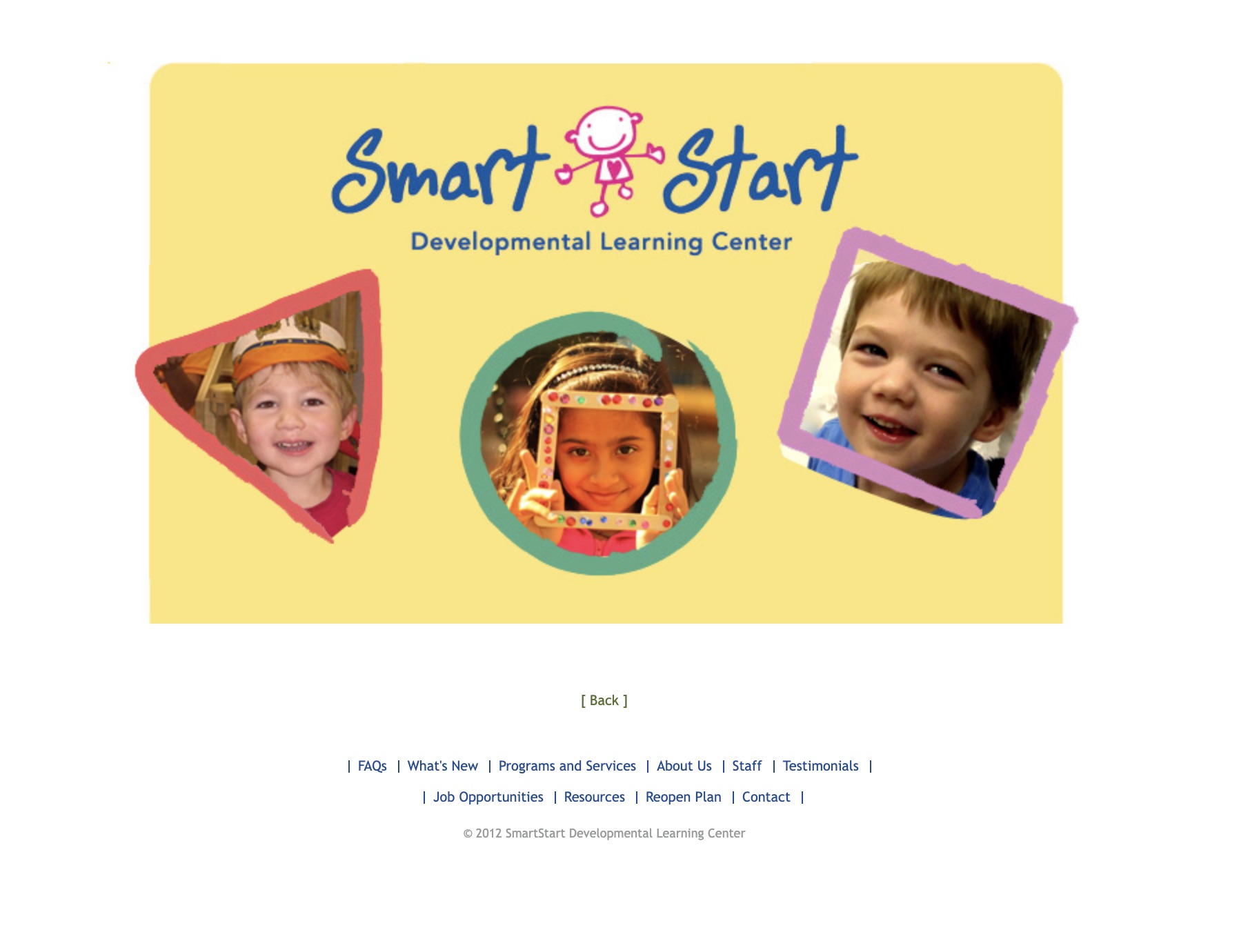
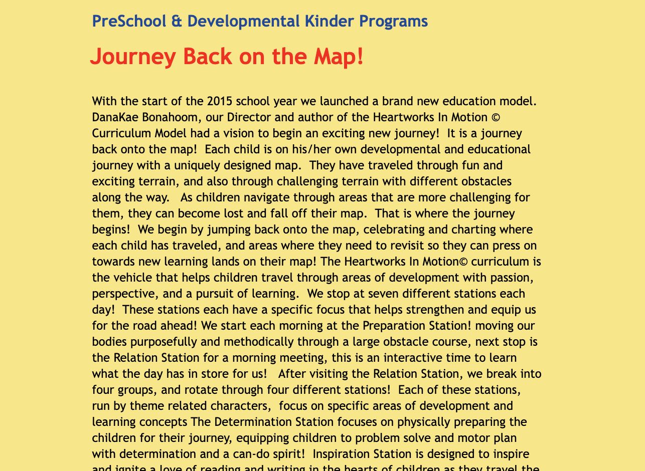
Solution + Goal:
A brand identity for SmartStart that allows special needs children to feel like they belong.Challenge:
Questions that framed my design thinking were:1. What does a space that fosters a positive environment for special needs children to learn confidently & feel appreciated look like?
2. How do colors impact children’s sensory systems?
3. How does the approach I take differ from branding a diverse and public preschool?
Process + Inspiration:
I looked at preschools that exist with beautiful identities that fostered a welcoming and playful energy. Spaces that evoked feelings of exploration, excitement, and growth were key.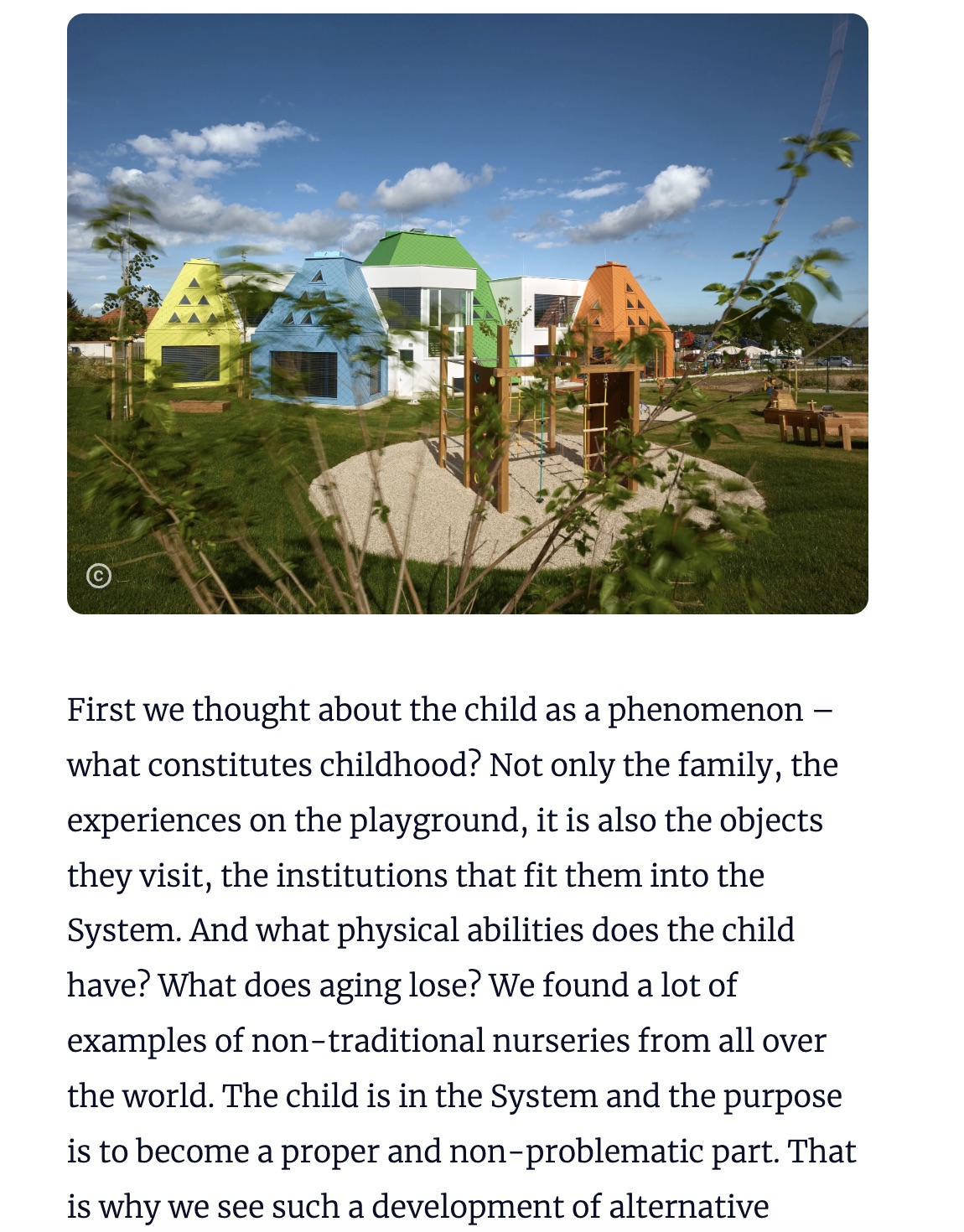
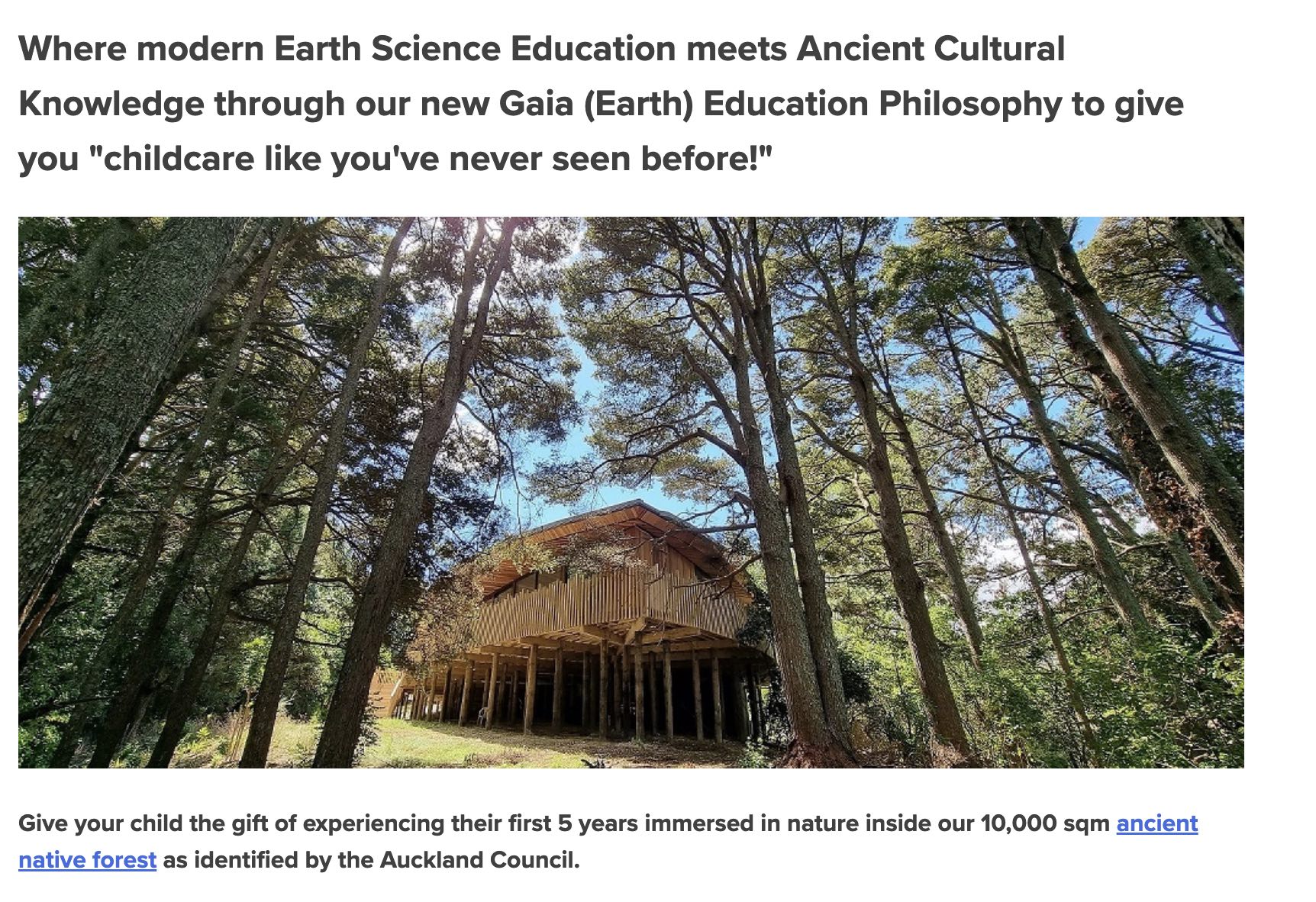
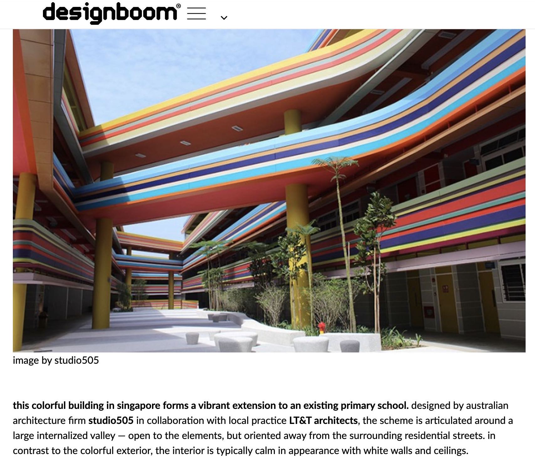
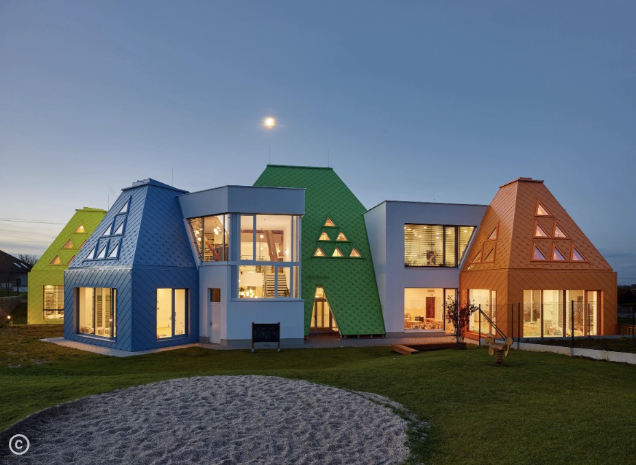
Once inspired, notes of thoughts and endless sketches were made, launching me into the rebrand with the clear visual aesthetic I wanted to achieve.
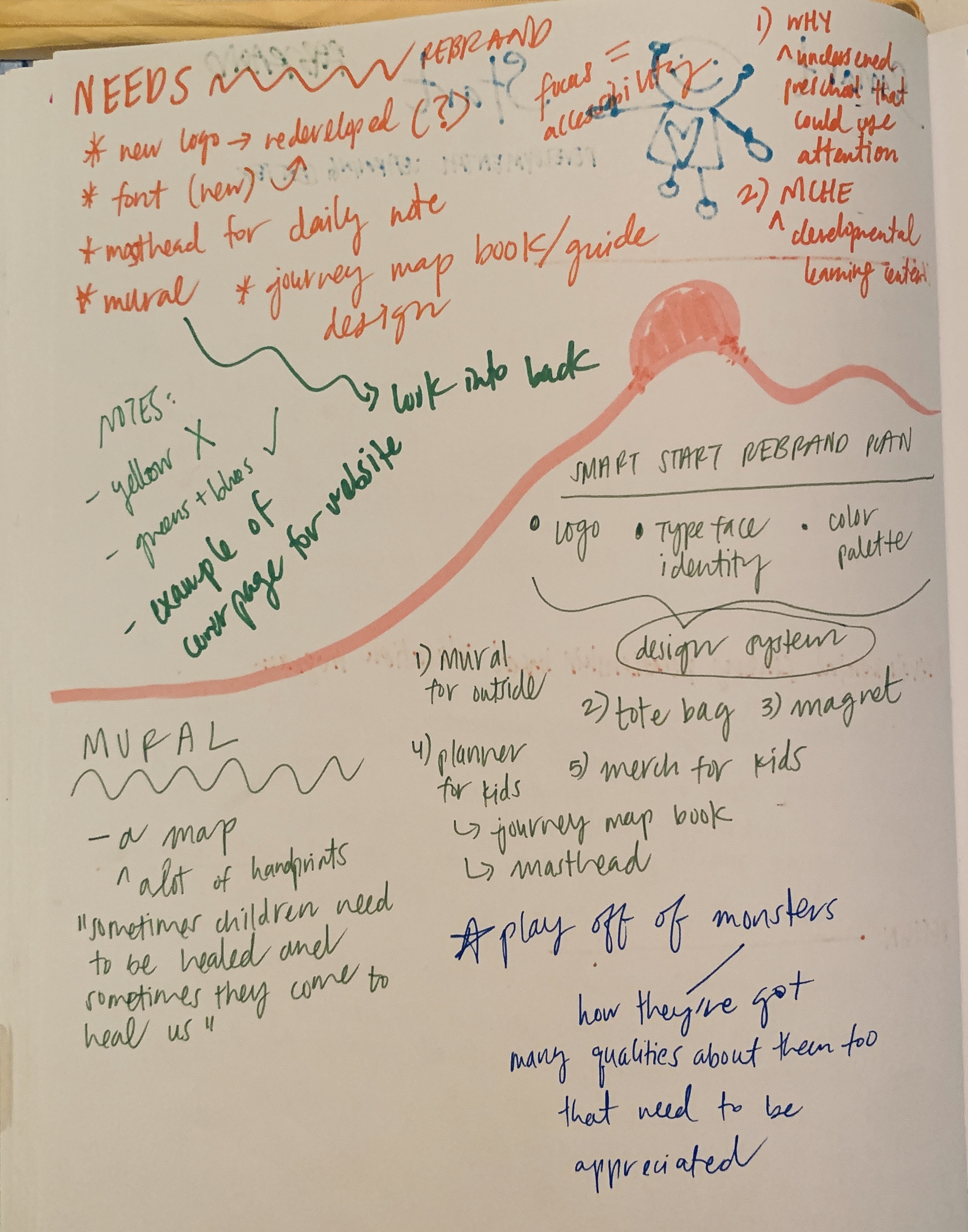
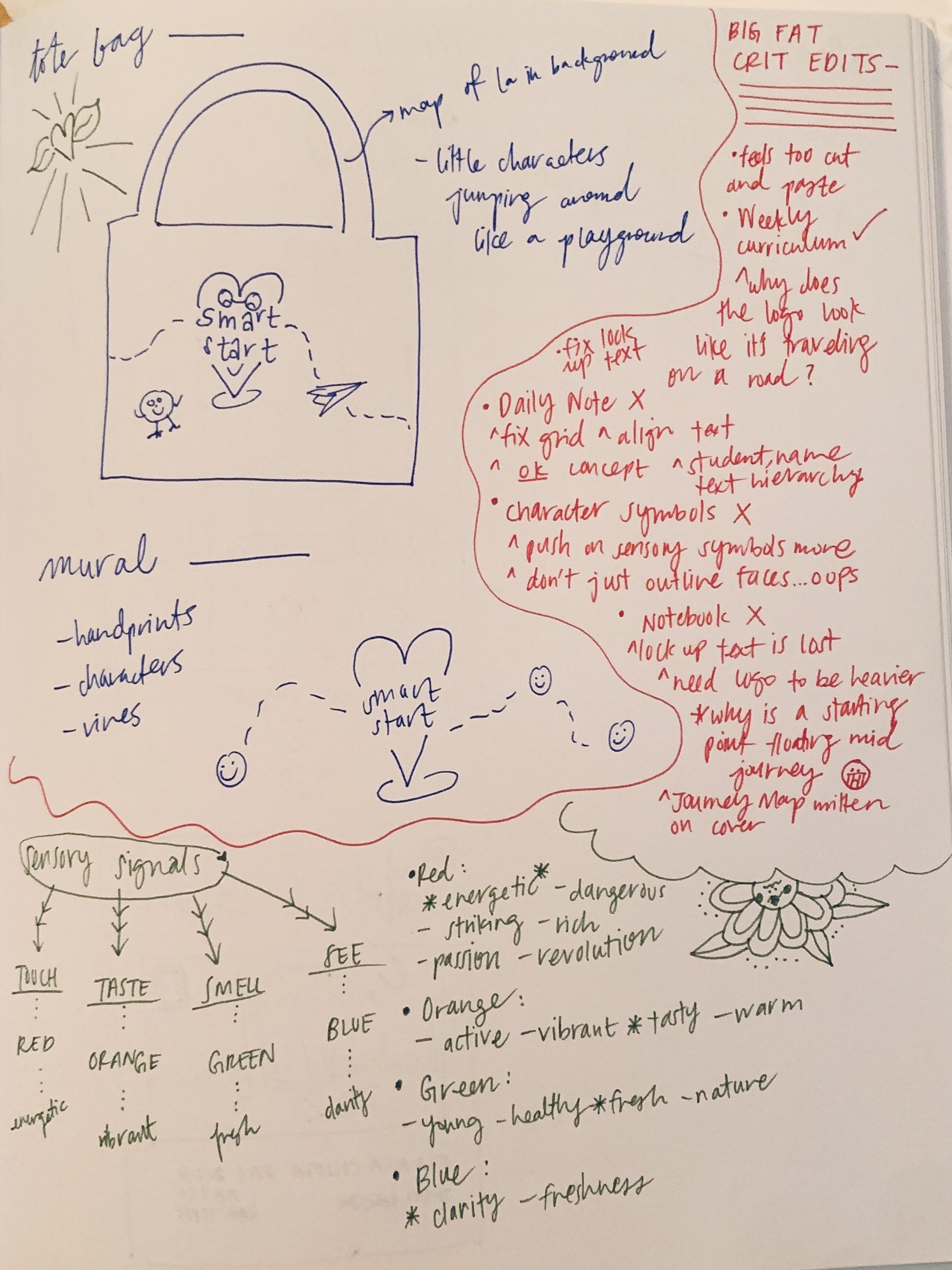
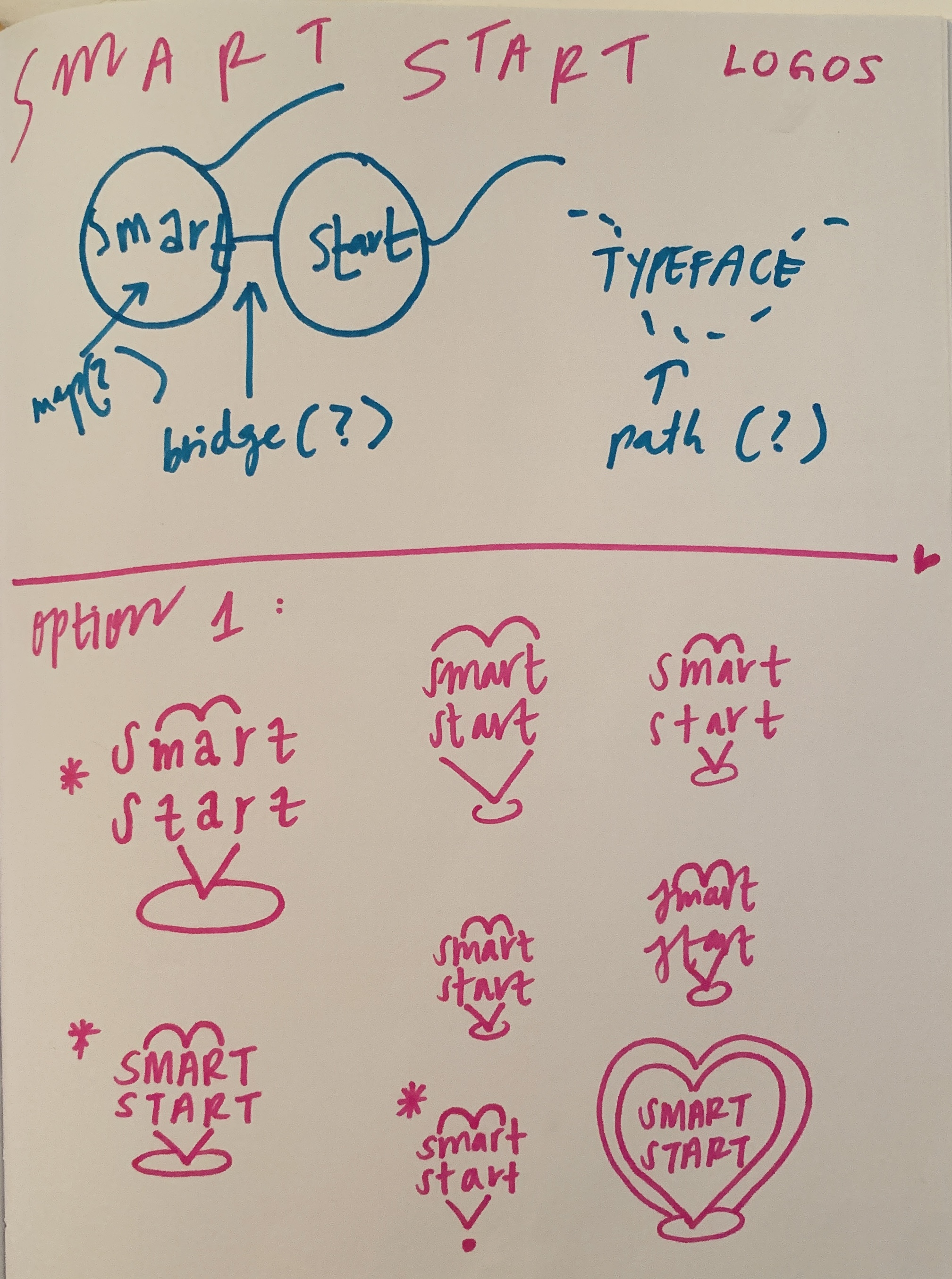
Approach:
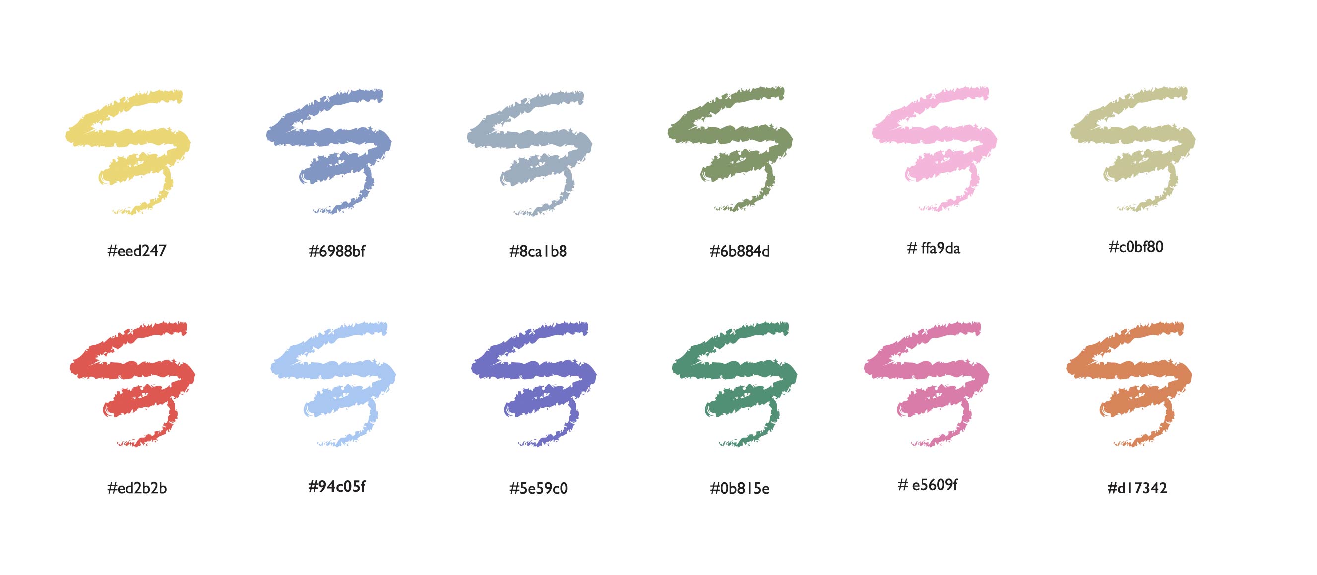
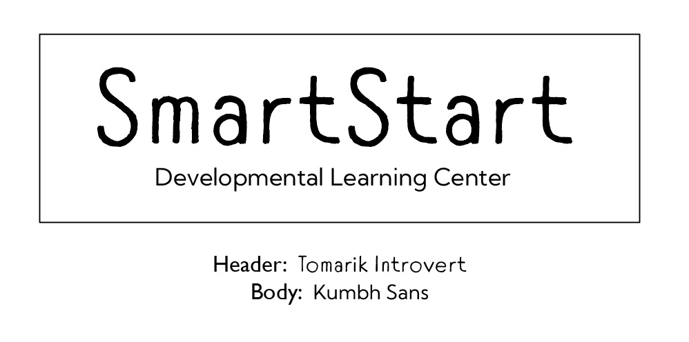
The typefaces chosen were to drive the playful nature of the preschool while keeping accessibility in mind. As for the colors, they had to be bright and welcoming.
Logo Process:

The original logo felt outdated and too similar to other Education logos.
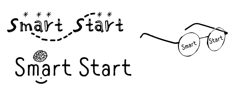
However, I did appreciate how the typography held character.
These were a few drafts of experimentation but none of these versions felt right and read as a logo. I wanted the logo to still encapsulate the playful energy of the original logo.
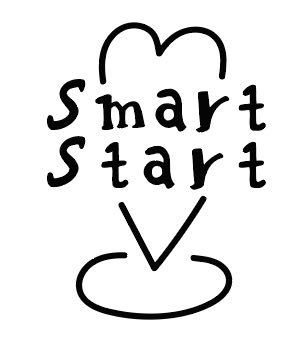
However, there was one sketch that I felt had potential...
Drawing upon the word “start!” this was trying to represent a destination pin, but with a heart to show passion.
This one was a suprising since it was an experimental sketch, but it seemed the most interesting. A challenge I came across while designing this logo was that it was lacking an immediate recogition in representing Education.
After committing to this design, 47 variations were made.

Logo Suite:

The Five Senses Character Symbols:
At SmartStart, there is an emphasis on Literacy, Language, and Sensory-Motor development. Because of this, I felt that it would be helpful for the students to have companions with them along the way in their journey since hearing, sight, smell, taste, and touch help us understand the world around us. These illustrated characters represent the Five Senses and they are a critical part of the brand identity.
The Character Symbols are tied to the children’s educational journey by being a constant supporting “friend” within the identity of the preschool, such as the notebooks and murals etc.

Their outline, similar to the logo, emulates the energy of a destination point to communicate the Five Senses as “points” of growth.
Mural + Signage:

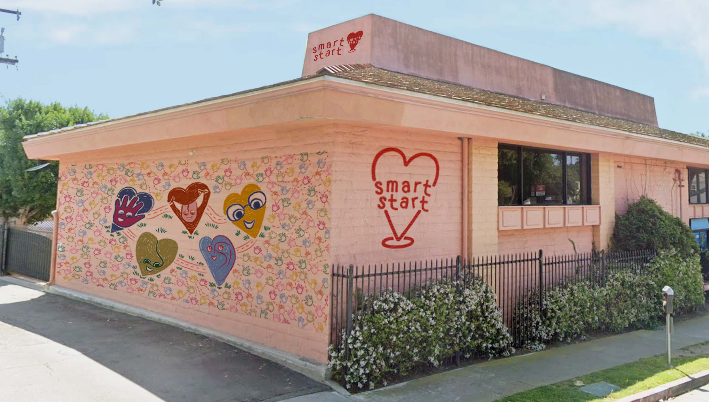
Problem: The exterior of SmartStart fails to represent the warm and loving energy the school represents.
Solution: Designing a mural for the Preschool to mark the school with a warm presence and welcoming first impression.
This mural reflects a roadmap of the Five Senses coming together with a community of helping hands, which represent the children. The side and top of the mural additionally serve as signage to locate the school.
School Material:
SmartStart provides parents with the following materials to support and be informed about their child’s educational journey. These materials were redesigned in a fun format to help the parents and children materialize and enjoy all the information they receive in an organized manner.1. Daily Note for Inbox
2. Weekly Curriculum for Inbox
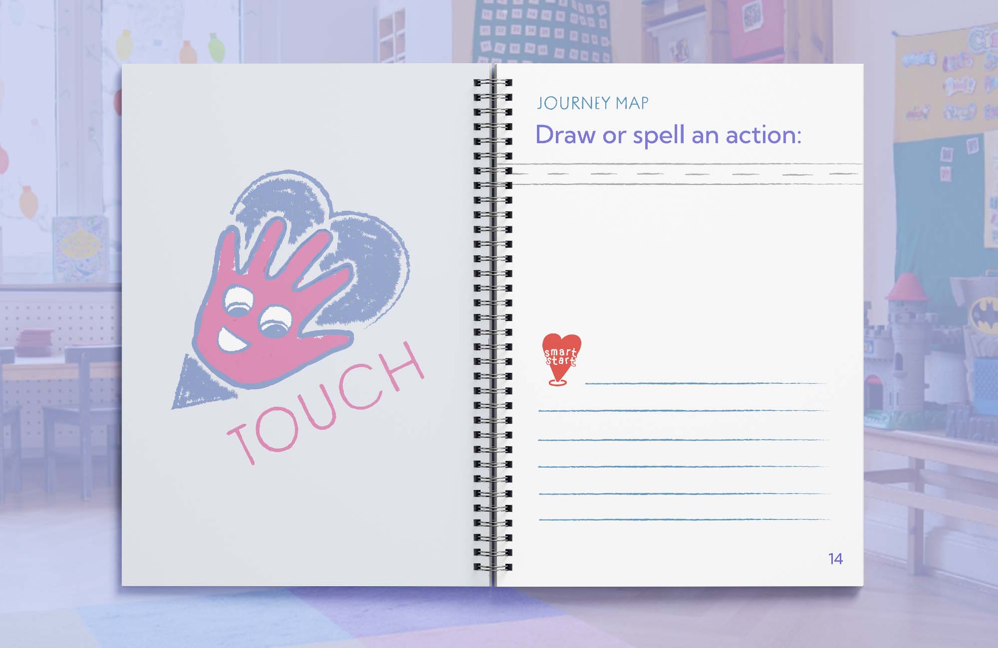
3. Journey Map Notebook
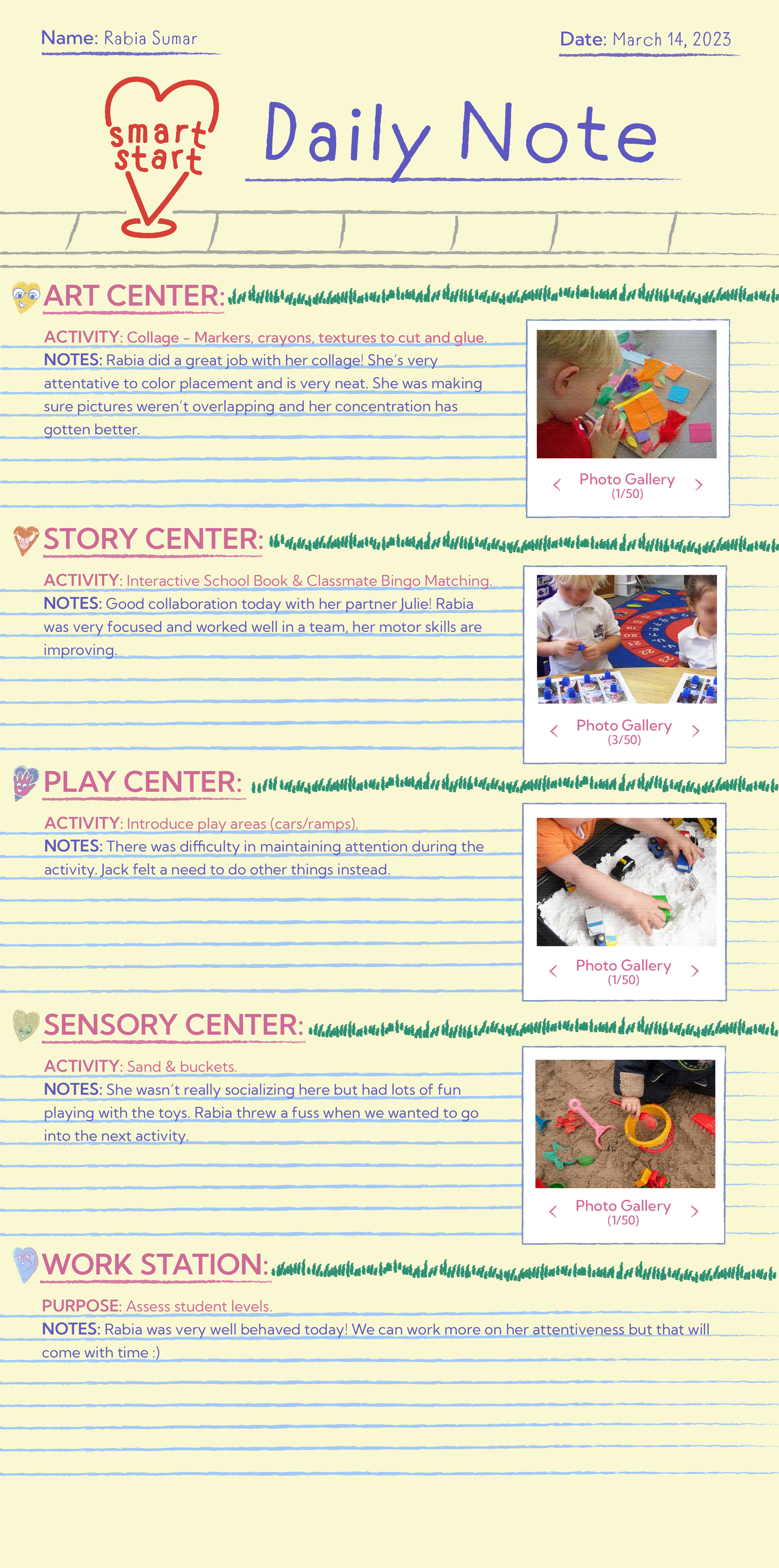
1. Daily Note for Inbox:
The Daily Note describes the activities the student participated in as well as a gallery with pictures every night.2. Weekly Newsletter for Inbox:
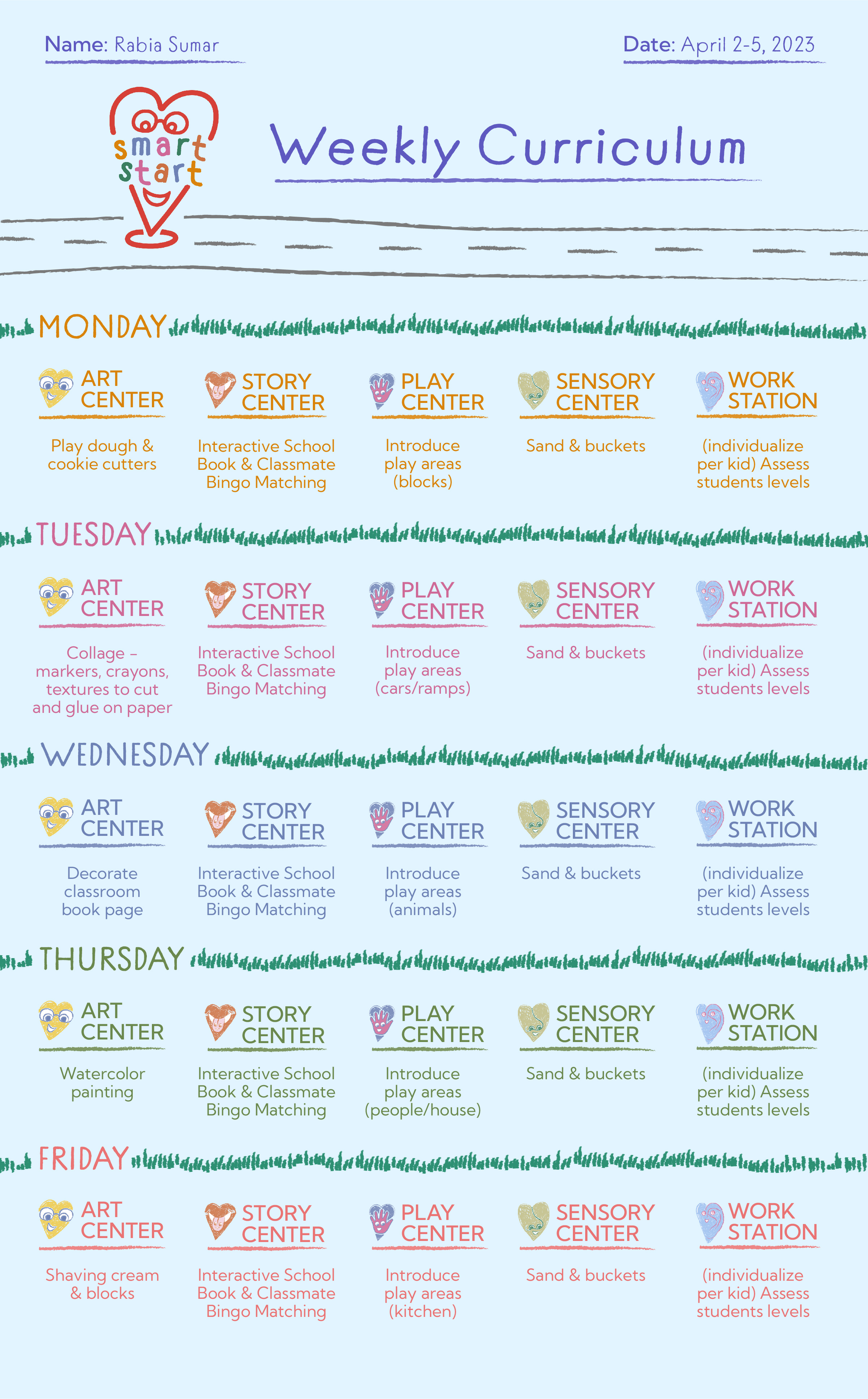
The detailed Weekly Curriculum is a schedule that prepares the preschooler for the week ahead. 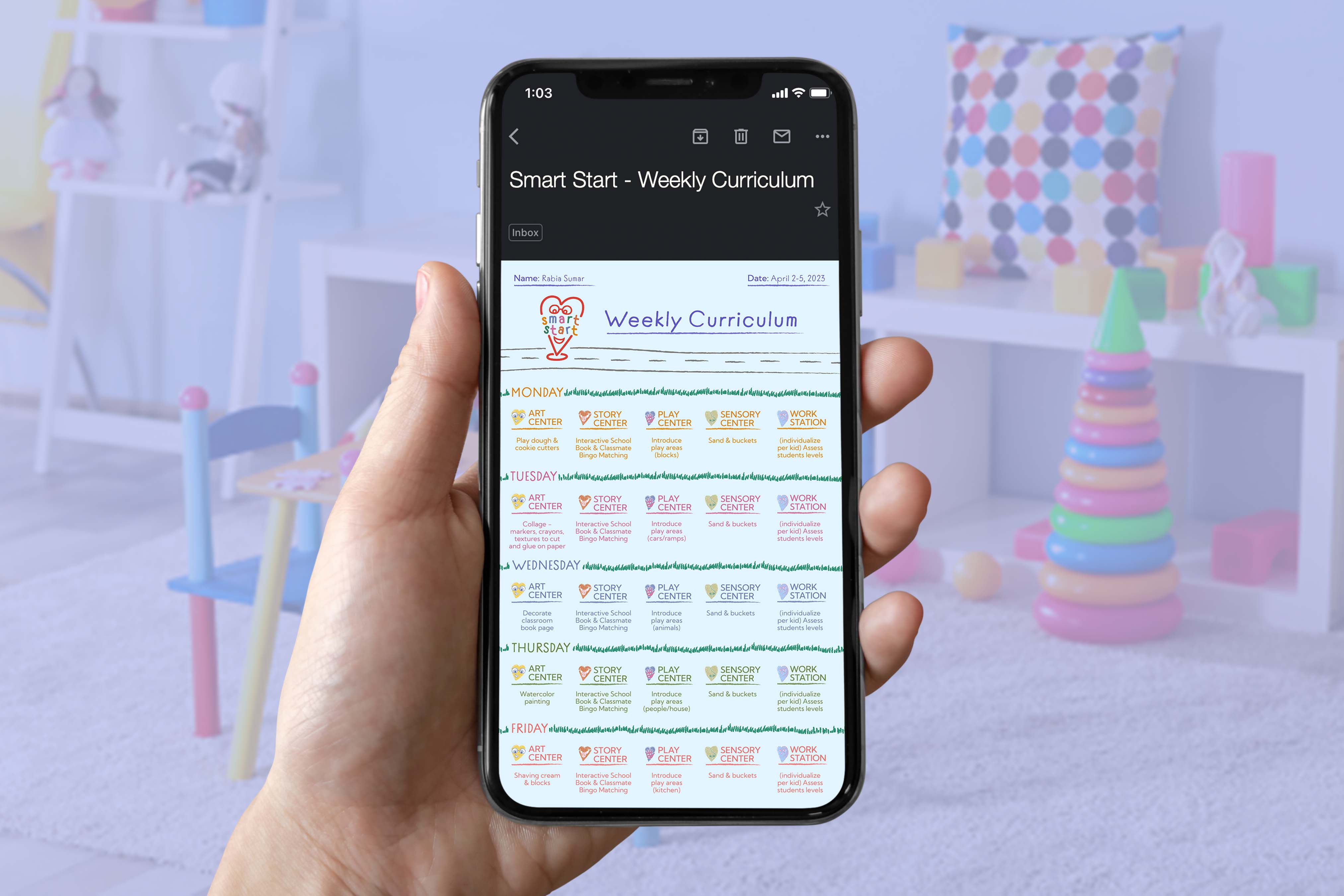
Daily Note & Weekly Newsletter Template:
3. Journey Map Notebook:
This is an activity book redesigned to get the students excited about learning. The Journey Map Notebook is provided to each student that is on their own developmental and educational journey with a uniquely designed map.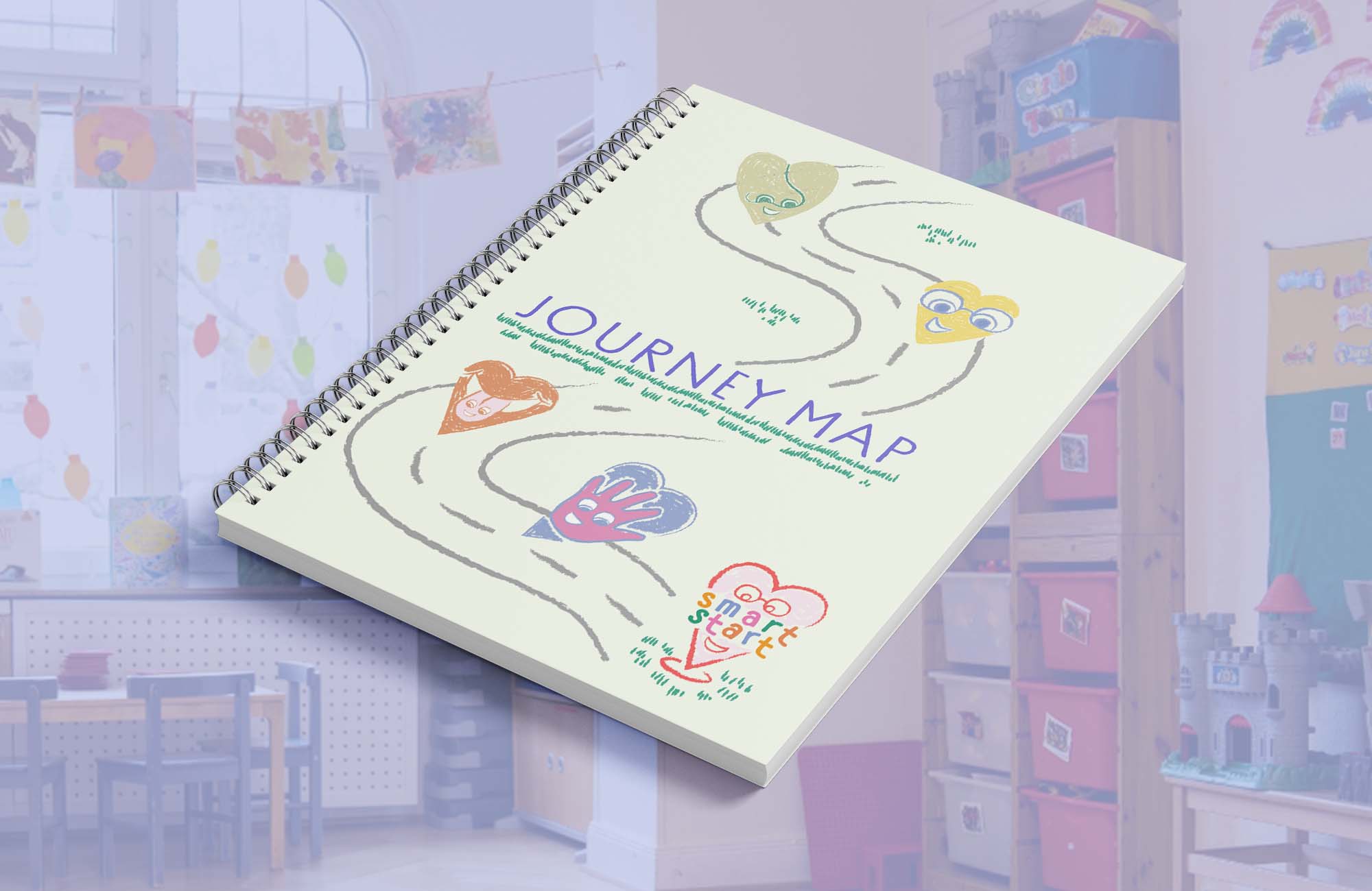
Merchandise:
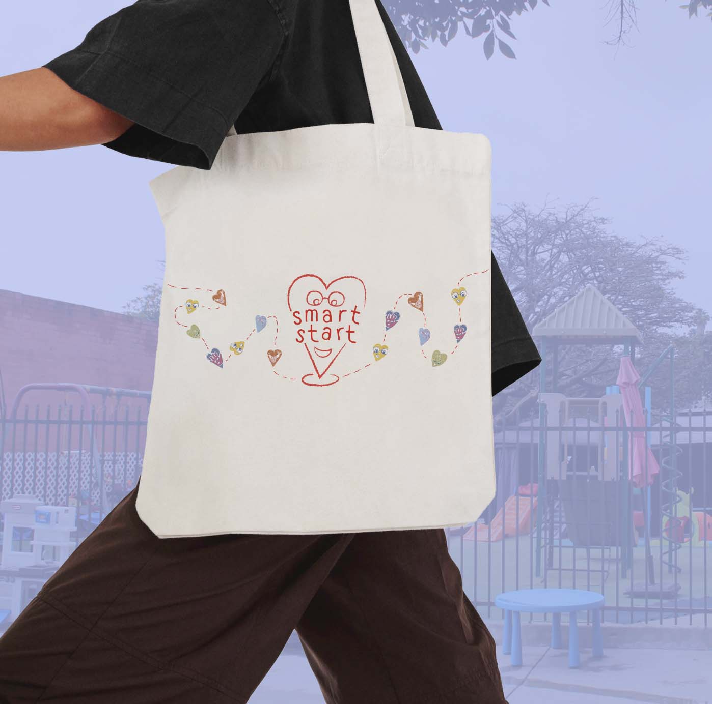
Who doesn’t love a cute tote bag? This was a must for the parents, they deserve appreciation too!
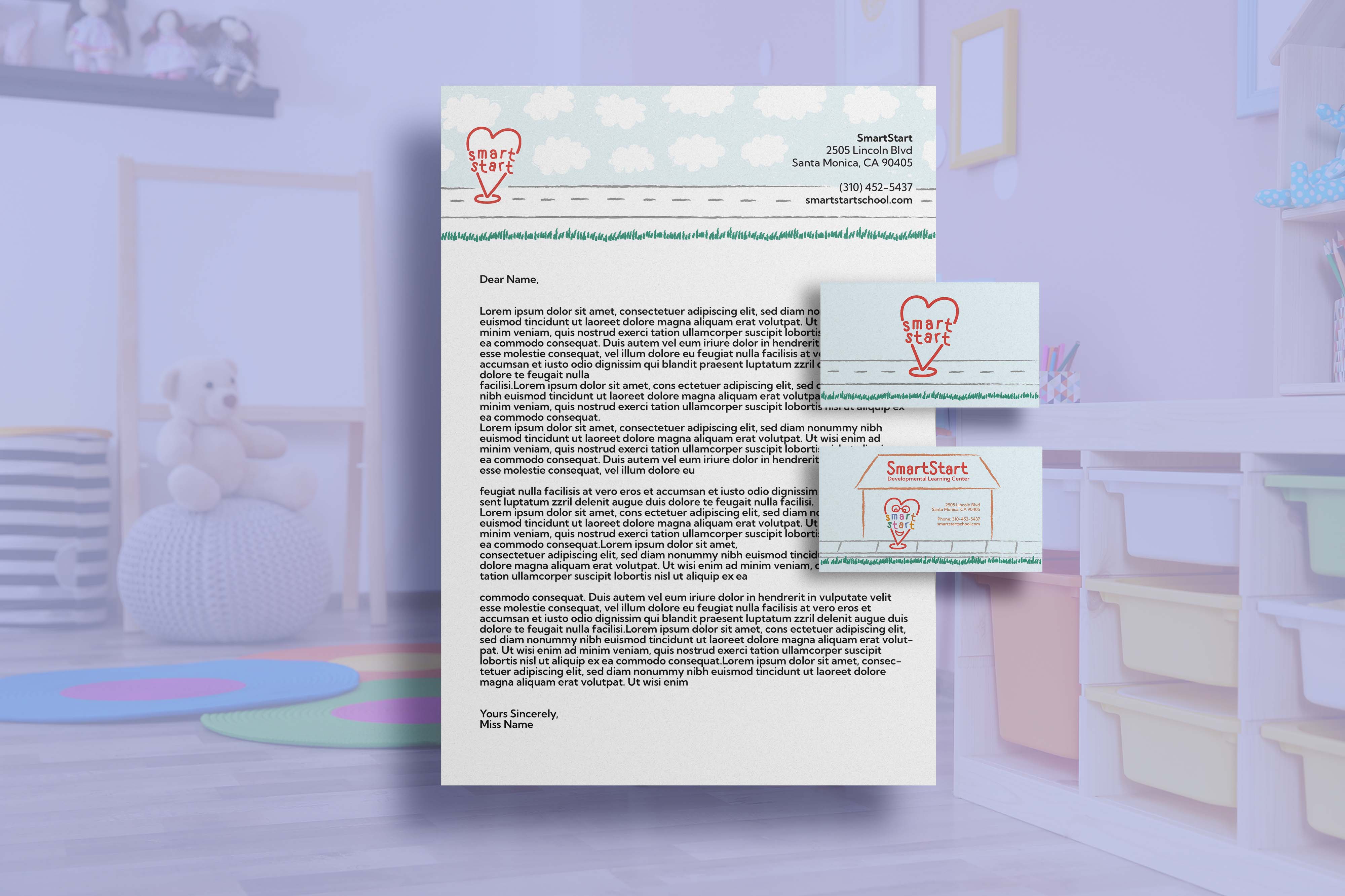
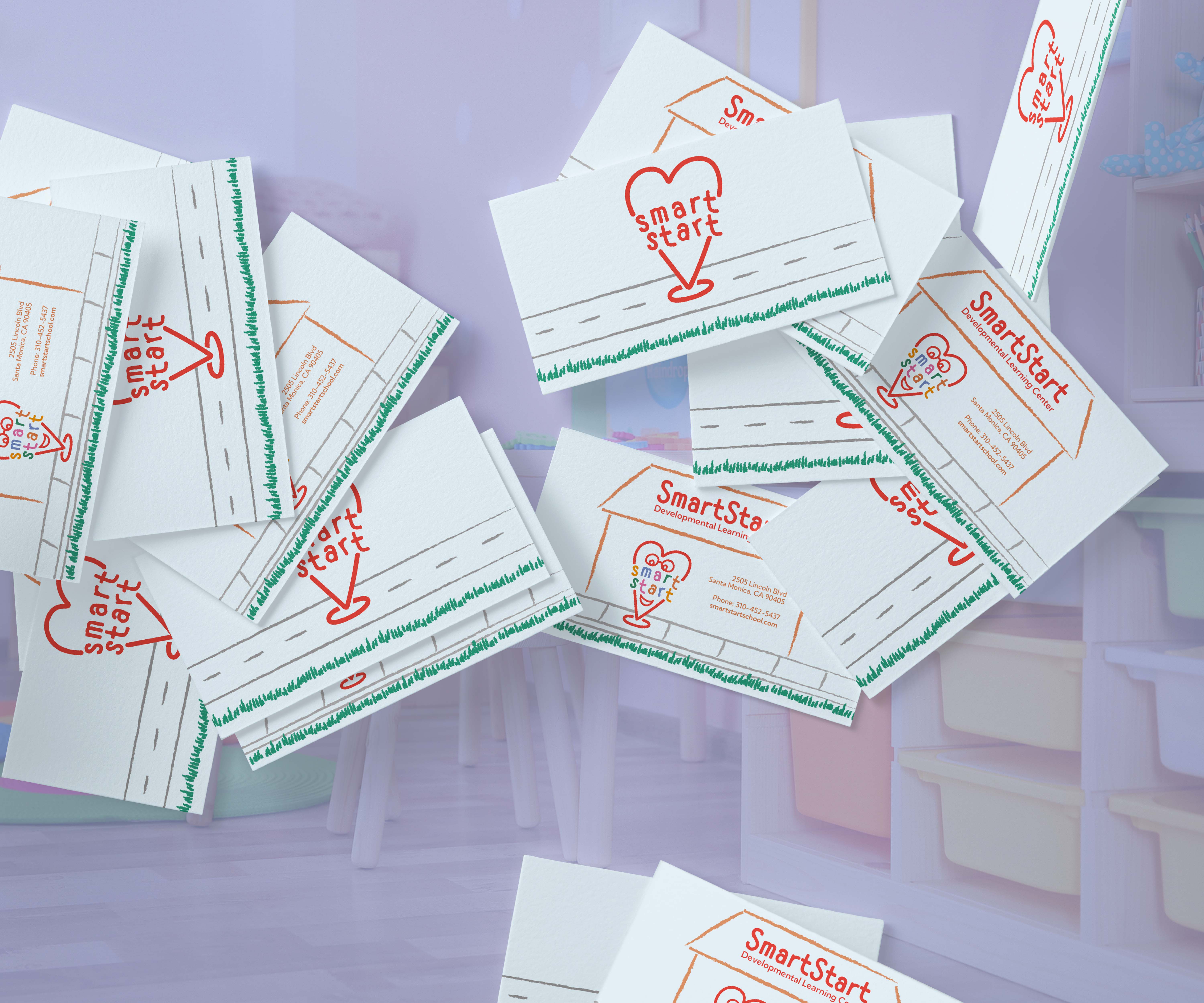
Businesscard & Letterhead:
Reflections:
This project was very exciting to me since I’m fascinated by how environments can come to life through the magic of branding.Designing the logo was the most challenging part of the project for me but once I had a clear idea of the direction I wanted to take with the logo, the identity was easy to form. I’m really proud of the Five Senses Characters because I never really considered myself an illustrator, but this really allowed me to tap into my doodling obsession and take it up a notch. The characters also drive the concept that in a world that doesn’t welcome those with disabilities, they will always have a friend to protect them.
Overall, this is the work that I really love to do. Places that help others deserve really beautiful identities and I can only hope that I have a chance to do projects like this for the rest of my life.
Tools Used: Illustrator + Indesign + Photoshop
June 2023